Newcastle Museum: A quick review

"Anti-war protestors" at the Newcastle Museum opening

Last week, my local museum reopened in a brand new location. The old museum had closed about 4 years ago in preparation of the redevelopment, so I was very exited to see the new museum. The new building, which cost $23.5 million and is the biggest project undertaken by Council in recent years, will house three permanent exhibitions as well as semi-permanent displays.

First impressions:
On opening weekend, the new museum was teaming with life. It’s located in some refurbished woolsheds only a couple of hundred metres back from the harbour, in an area that’s undergone significant new development in the past decade. The area is filled with restaurants, gyms, apartment complexes and people, and the new museum fits into its new home incredibly well – integrating the past and the future.

The museum had hired young actors to dress in historical garments for the opening, which instantly connected the new with the old, affirming the museum context. These living displays brought a very lively presence into the museum, which made for a great first impression.

My favourite caption!

The new museum has a lot going for it. It uses colourful inbuilt wall displays to show images that give context to artefacts without requiring long periods of reading. It has a huge interactive kids exhibition as one of the three permanent spaces (the predecessor of which was my favourite thing at the old museum when I was a kid). TV screens have been incorporated into displays to show changing historical images, though I didn’t see any other real use of technology. I was only aware of one interactive display outside the kid’s area (and it was for kids too). There were no hands-on experiences for adults, which is a shame since I still want to touch things in the museum just as much as I did as a kid.

The museum has some cool objects – including an the old rusted Model T Ford, which was given contextualisation by text panel that explained a number of different interpretive premises for the object’s inclusion in the “Newcastle Story” exhibition (including one paragraph on ‘museological choices’, which is a little more meta and self-reflexive than most museum panels). The old car had wooden spokes for wheels, and still had a hand-written message scrawled in the dust on the dash. To me, it spoke of the history of technology and human nature all tied up in one artefact.

My other favourite object was a biscuit wrapped in cloth that had survived from the trenches of World War II. It was a hugely affective piece for me, because my mouth could immediately taste the biscuits, and my imagination grappled with thoughts of what living through the way might have been like. The bodily sensations that I experienced looking at that one object really affected me far more than other objects, which were simply pretty or interesting. My PhD supervisor Dr Kit Messham-Muir has done work on affect in museums, and wrote about this in a 2008 exhibition essay. He writes:

The physicality of objects and sites, their smells, tastes, textures and presence can trigger intense sensory memories. Importantly, sensory memory is different from the remembering of linear narratives; sensory memory involuntarily conjures vivid past events into the present.

This is absolutely what I felt when seeing the WWII biscuit.

Having said that, although some of the objects were pretty cool, there didn’t seem to be a lot of objects. Both my husband and I walked away feeling that we hadn’t really seen much. There was a big space, and it seemed like we should have had lots of exploring to do… but in a short time, we felt like we’d seen everything. Now, maybe that was the busy atmosphere, so we didn’t really take time to read all the panels and look at the displays with the depth we would have with fewer people in the museum. However, for all the prettiness of the displays, I wonder if there wasn’t a conscious choice on some level to use images instead of objects. If so, I would love to know the reason why. The large colour wall displays were great – but not at the expense of more tangible objects and stories. Pictures might seem more self-explanatory, and they can certainly add context… but I’m not sure that I respond to them as a replacement, instead of an addition.

Image-driven displays - pretty, but sadly lacking in objects

The new museum does have a very large external space that looks perfect for family outings and activities, and on the weekend it was brimming with laughing kids – so that’s a great start. Having chatted to the museum’s public programs officer a couple of weeks ago, I think they have grand plans for building the space into a very active part of Newcastle’s cultural life, which will be fantastic. But it will be interesting to see whether the museum’s emphasis on events can sustain it when its objects are fairly sparse.

How do you guys feel about museums that (seem to) put an emphasis on events/displays over objects? Are they sustainable? Effective? It seems to me that this will be able to bring a sense of life to history – but maybe not the same sense of connection… But that’s an intuitive answer, and I’d love to hear of people’s actual experiences of this split between the two.

And you never know – when I go back to the museum on a day that’s less frantic, I might have a different impression. But my first sense of the place is that it’s fresh and active – just with fewer artefacts than I expected, and maybe that I would have liked. The experience has made me realise just how much I do love/want objects in my museums.
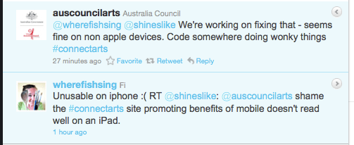
A very quick post on practising what you preach

The Australia Council has just reached their new research report called Connecting:// art audiences online. I haven’t had a chance to have a full read of the report in depth just yet, but one thing leaped out at me this morning when I started looking through the website… The website, which contains pieces of advice like this:

The internet – and in particular, mobile technology, provides a range of opportunities for arts organisations to make it easy. Already, there’s strong adoption of mobile apps in relation to arts events, with strong interest in apps to support ticket purchases, program customisation, interaction and content sharing, to name just a few.

cannot be read fully on my iPad. I was flicking through the site first thing this morning, and was pretty frustrated to find that the text on the site would not scroll so that it could be read in its entirety. I could see the start of bar graphs, but not the important information at the other end of them. I thought the report was relevant enough that I would actually try to access it again from my laptop… but very easily I could have just dismissed it as inconvenient and not looked again.

If you are going to talk about the importance of mobile technology, then please consider how mobile audiences will access your information when designing your site.

FOLLOW UP: But here’s the nice thing about social media, and a demonstration of how to use it well…  OZCO responding to the problems mentioned above.

Review: Artfinder.com

An interesting start-up caught my eye today when featured on Mashable (although it turns out the company was at Museums and the Web – so it’s a shame I didn’t see them there). Artfinder combines a website, an artwork-identifying smartphone app, and a pile of iPad apps. According to their website, the company is:

partnering with a growing number of large and small galleries, museums and picture libraries worldwide, in particular with Bridgeman Art Library and Cabinet UK. On the Artfinder website, consumers can create their own personal ‘art gallery’, collect their most-loved artworks, and share them with their friends via Facebook, Twitter and email. Additionally, Artfinder’s innovative ‘magic tour’ helps consumers discover art whilst also exploring works that are recommended by friends and passionate experts.

Options for interacting with the site include an Art Shuffle option and the aforementioned Magic Tour (although the ‘choose your favourite’ images that the tour used to decide which path to send you down seemed a bit limited in range, and I wasn’t actually very excited by the art I was recommended – but the idea was fun). Each work of art on the site links to its originating gallery, and can be shared via Twitter or email and ‘Liked’ on Facebook. On the bottom of each work of art, there is a discussion question (How does this make you feel? What do you think about this artist?) which again links to Facebook. And in the Art Guides there are short descriptions of art movements, like the Renaissance (below).


But I think the really interesting thing about the site is that the works of art have been commercialised, with visitors given the opportunity to buy a copy of the artwork. According to the stats on Mashable, the Gallery currently has over 500,000 works of art, and has partnered with about 6,000 galleries, and this gives those galleries an interesting new opportunity for gaining a bit of commercial profit for merchandising – not to mention a new way to find out which works of art in their collections are the ones that people really want to buy. Imagine if the Bridgeman Art Library discovers that hundreds of people all want to buy one work of art they’ve never even considered merchandising… it could be a pretty interesting way to get some market research on the demand for merch for the collection.

One of the co-founders of the website used to be COO at Last.Fm, and I think that there are some obvious cross ideas at play conceptually… the notion of discovering and sharing art in this context isn’t too far from the idea of musical discovery on Last.fm. But unlike Last.fm which has a lot of great current and contemporary music on it, most of the art currently on Artfinder seems to be from a previous era (one where copyright has lapsed, I imagine)… The page on Postmodernism doesn’t seem to include any links to art – although some key artists are profiled – and there seems to be little discussion taking place about what’s happening within current art conversations. This is something I think could make the site more interesting, and is no doubt something that will come with time.

So what do I think of it as a site? Artfinder has some cool ideas, but I do think it is missing the expertise and authority that museums can and should have. I don’t necessarily trust the Artfinder brand to teach me about art in the same way I would a more established museum (rightly or wrongly).

The site still operates as a silo. It might link works of art across lots of galleries – which is cool because it brings together disparate collections into one place – but the information contained on the site seems to be entirely derived from within, rather than linking to external information sources and leading to a more interesting and serendipitous journey of discovery. There also doesn’t really seem to be much narrative accompanying the site/works, and it would be nice to have great sense of a story when looking at interesting art.

But possibly my biggest criticism of the site is that it asks nothing of me. I can flick through the pretty pictures, but there’s nothing compelling to really engage me – yet (though maybe as more people interact with the works online, that will change). As Jonathan Jones writes, in his review of the site, “Artfinder is another fine way of skimming the surface of art history. What the web needs next is a deeper exploration of great art.”

I’d be interested in hearing other people’s thoughts on the site. Have you used it? Would you use it? Did anyone see their demonstration at MW2011? And if so, what impressions did you get?